
So you guys understand what changes have been made, we’ve decided to break it down for you. Below is an overview of the new blog design.

The overall look of the new design is fresh, but simple.
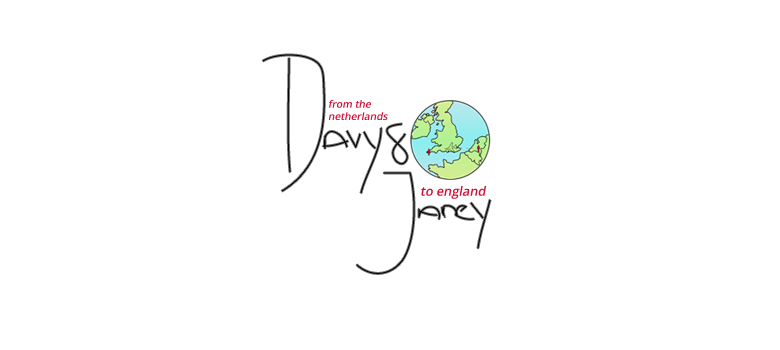
As you can see we have made some tweaks to the logo. We’ve took away the ribbon banner, and the large bulky font. We wanted something that captured our personalities, and a logo that really captured what our blog was about without being too complicated and having too much on it. We decided to keep the little miniature globe, as we feel that it shows part of our long distance journey. It tells you which part of The Netherlands and England that Davy and I are both from/currently residing.
Next up is the navigation bar. This font is far nicer than its predecessor - Courier. This font is called Crushed and can be found in the drop down menu of the blogger design options. We felt that it really complemented the logo.


We’ve adjusted the font for the date. This gives some contrast to the rest of the blog. We think it’s a nice little touch.
And just a few more things; we’ve kept the font for the text within each blog post. We went through some others, but we just really enjoyed the look of what we had. Lastly, we’ve changed the signature that appears at the end of each post - which you can see, ironically, at the bottom of this post!
If you have any comments or thoughts on the refined design, shoot us a comment! And don’t forget to follow us on BlogLovin’ <3 we’ll give some love back!

No comments:
Post a Comment
Feel free to share your thoughts and opinions! We'd love to hear from you, and we promise we won't bite. All we require is your fingers to tippy-tap on that keyboard of yours and ta-da! Feel free to also post your blog link at the end of your comment, we'd love to check other people's blogs out too!